Film Poster

The film is called The Ring Two which was released in March 2005 and directed by Hideo Nakata. The film was produced by Walter F.Parkes, Roy Lee and Laurie Macdonald. Its production company is DreamWorks pictures. The ring two starred Namoi Watts, David Dorfman, Simon Baker, Elizabeth Perkins, Terry Crewes, Daveigh Chase, Sissy Spacek Ryan Merriman, Emily Vancamp, Kelly stables and Mary Elizabeth Winstead. The ring two is a sequel to the 2002 film ‘The ring’ which was a remake of the 1998 Japanese film of the same name. The film is about a video which is passed down to a family. However, the video is not a normal video. It’s of a possessed girl who lives in a whale and whenever you watch the video you get the phone call saying you’ll die in 7days. When the 7 days were up the psychotic girl crawls out the TV from her wale and you die.
This poster
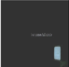
is a long shot of the girl which enables the viewers to see the girl from head to toe and her costume and also a part of the setting. There is low key lighting all around the picture however in the middle the lighting is slightly high key which divides it from the rest of the poster as it stands out amongst the dark black background. The use of low key lighting connotes bad, evil things as it is a dull colour also black is associated with the end of something and also death therefore it enables the audience to have slight insight on what type of film it is. This follows the convention of a horror poster as they all tend to use low key lighting. However the glimpse of high key lighting enables the main subject of the poster to stand out and to grab the audience attention. The poster is quite plain and quiet as there are just a few texts and one image this makes audience wanting to know more as the poster does not give off to much information about what the film are about which them drags them in to watching the film. The subject is in the centre and symmetrical of the poster which suggests that it is the most important thing and it is eye catching as it has a harsh focus. The setting looks like it is in dark room with light shining upon the subject. The costume of a subject is long drapes which suggest that the person must have some type of issue and there are no props used. There is a long shot of the subject enabling the audience to see the subject from head to toe, to show the costume and a bit of the setting. There is a caption under the picture which quotes ‘Fear comes full circle’ this caption supports the context of the poster as the word fear connects to the use of the low key lighting and the subject who looks comes of as suspicious in the centre
The ‘O’ in the Two connotes the whale and the ring which is also part of the title this is why it is very effective. So the title is also represented as part of the image. This is a key symbol for the film which enables the viewers to identify the film. The ‘O’ is also in the centre just above the girl which is the main image with her head in the bottom of it. This makes the title very eye catching and also grabs the viewer’s attention. The font looks hand written and as if a child wrote which also creates suspense to the viewers. Also it looks like the poster has been scratched which suggests everything is distort.
This poster
is a long shot of the girl which enables the viewers to see the girl from head to toe and her costume and also a part of the setting. There is low key lighting all around the picture however in the middle the lighting is slightly high key which divides it from the rest of the poster as it stands out amongst the dark black background. The use of low key lighting connotes bad, evil things as it is a dull colour also black is associated with the end of something and also death therefore it enables the audience to have slight insight on what type of film it is. This follows the convention of a horror poster as they all tend to use low key lighting. However the glimpse of high key lighting enables the main subject of the poster to stand out and to grab the audience attention. The poster is quite plain and quiet as there are just a few texts and one image this makes audience wanting to know more as the poster does not give off to much information about what the film are about which them drags them in to watching the film. The subject is in the centre and symmetrical of the poster which suggests that it is the most important thing and it is eye catching as it has a harsh focus. The setting looks like it is in dark room with light shining upon the subject. The costume of a subject is long drapes which suggest that the person must have some type of issue and there are no props used. There is a long shot of the subject enabling the audience to see the subject from head to toe, to show the costume and a bit of the setting. There is a caption under the picture which quotes ‘Fear comes full circle’ this caption supports the context of the poster as the word fear connects to the use of the low key lighting and the subject who looks comes of as suspicious in the centre
The ‘O’ in the Two connotes the whale and the ring which is also part of the title this is why it is very effective. So the title is also represented as part of the image. This is a key symbol for the film which enables the viewers to identify the film. The ‘O’ is also in the centre just above the girl which is the main image with her head in the bottom of it. This makes the title very eye catching and also grabs the viewer’s attention. The font looks hand written and as if a child wrote which also creates suspense to the viewers. Also it looks like the poster has been scratched which suggests everything is distort.
Magazine Cover

Horror hound is a successful horror magazine company who create magazines advertising film release such as; Halloween, exorcist, wolf man and much more. They have a website for readers to purchase their magazines and order them and also give the option for people to subscribe to their magazines this suggests that they have regular intervals and distribute their magazines monthly. This is useful as readers tend to like being updated on film release and read magazines regularly therefore subscription would benefit some people. The website also caters in the clothing department too as it sells t-shirt, underwear and hoodies with the horror hound logo branded on it.
The movie magazine denotes Scream who is a worldwide horror film icon is holding his knife. There is high key lighting with the mixtures of colours red and orange which connotes fire which represents hell. This could suggest death and fear which also highlights the main purpose of horror films. There is a mid shot of the main subject is in the bottom centre of magazine and is asymmetrical. This allows us to see part of the costume. The main subject is wearing a black cape which connotes doom and he is also wearing his iconic masks. This is very effective as allows people from all around the world to be able identify him. The prop used is a knife which is also iconic. Also this supports the convention of horror films as there always reds to be some type of weapon used. The main image looks as if it was painted this could suggest craftsmanship and creativity of the magazine.
All the texts used on the page are San serif font which gives the magazine a modern sense to it and enables readers mostly the young as they tend to be the target audience and allows them to relate to it. Moreover, the masthead is all in capitals and bold this is used so that readers can identify what magazine it is quicker and it is more effective. Also it is positioned in the top centre of the page. The colour of the texts is black with a bold white outline as it helps it stand out effectively amongst the orange and red background. The colour black connotes doom which supports the meaning of the genre of the magazine. In addition there is the title of the film conveyed called ‘Scream 4’. The word Scream is in red. This colour suggests hell and blood which is a common convention in horror films. This colour theme gives of the horror feeling to the readers and allows them to identify the genre of the magazine much easier. The film title is in big capitals and it is bold this is good as it helps stand out on the page and grabs the reader’s attention towards the main focus of the magazine. The dateline is placed just above the masthead. The barcode is at the bottom left of the page; this is used to help people purchase the magazine. Also there is a website link across the barcode which links to the website of the horrorhound magazine therefore lets its customers view their other magazines. There are texts spread out at the top of the page separated by the logo. These are also cover lines which are informing readers on what is included in the magazine.
There are also cover lines going down on the left hand side letting the readers know of what some of the pages contain. There is a film advertised called ‘The walking dead’ which is a zombie horror film. This is a different genre of the main film being conveyed as Scream is a slasher; this shows that the horror hound magazine also explores various genres of horror films which expand its target audience. There are puffs advertised as one of the cover lines which are offering free movie horror posters inside. This is very effective is attracts a lot of people especially those who have a passion for horror films. Moreover, this supports the conventions of horror magazines as they tend to offer freebies as it increases sales. The font used for one of the cover lines saying’ the ghouligans’ is very effective as it is in yellow which allows it stand out amongst the dark background and looks as if blood however in yellow is dripping from the letters which supports the themes of horror films. There is text on top of the main image says ‘the return of ghost face!’ this is making a reference to the release of the films Scream 4 which is the main cover line of the magazine. However the font is slightly small so that it does not cause too much distraction and to prevent the page looking to congested. In addition, there is a logo at the top of the page which is used to help identify the horror hound brand. Logos are very effective for not only using in magazines but clothes, food, books etc. It has the number #28 which suggests the number of magazine it is which also helps readers identify which magazine their purchasing.
Film Trailer

The ring 2 is a very successful psychological horror film. It was released in 2005. It is a sequel to the film released in 2002 ‘the ring’. The ring was a remake of the original Japanese film of the same name in1998. The ring 2 grossed $72 million dollars which was far less than what the original film grossed which was $129 million. The textual analysis I will focus on the teaser trailer of the ring 2. The duration of the trailer is 78 seconds rather than 60 seconds however it is not too long or quick therefore it is acceptable.
The teaser trailer begins with Foley effects of the girl using scissors too cut the newspaper before we even see her doing it. This is very effective as it gives us an insight on what we are going to see next. Around 0.04 seconds to 0.38 seconds it fades in and out. It then switches to a close up of the newspaper being cut this enables the viewers to see more clearly on what is going on and what she is cutting. The newspaper headline quotes ‘arrested for daughter pool death at irisdale woods’ The use of this is important as the newspaper has relevance to what the film is about. It suggests that death is going to be a part of it. The camera then goes into a high angle shot of the girl sitting down cutting out the newspaper article. This allows viewers to see exactly what she is doing and the slow movement to the angle switch suggests time passing by. There is NVC as the girl is sitting there doing what she is doing. Next there is an establishing shot which shows the setting of a deserted room full of newspaper and the girl’s costume which is a long white dress which resembles the costume in the poster. The props used are scissors and newspaper which is shown through a close up as the camera focuses on it.
The teaser trailer begins with Foley effects of the girl using scissors too cut the newspaper before we even see her doing it. This is very effective as it gives us an insight on what we are going to see next. Around 0.04 seconds to 0.38 seconds it fades in and out. It then switches to a close up of the newspaper being cut this enables the viewers to see more clearly on what is going on and what she is cutting. The newspaper headline quotes ‘arrested for daughter pool death at irisdale woods’ The use of this is important as the newspaper has relevance to what the film is about. It suggests that death is going to be a part of it. The camera then goes into a high angle shot of the girl sitting down cutting out the newspaper article. This allows viewers to see exactly what she is doing and the slow movement to the angle switch suggests time passing by. There is NVC as the girl is sitting there doing what she is doing. Next there is an establishing shot which shows the setting of a deserted room full of newspaper and the girl’s costume which is a long white dress which resembles the costume in the poster. The props used are scissors and newspaper which is shown through a close up as the camera focuses on it.

There is score incidental music in the background which builds up tension and makes it feel as if something bad and evil is going to happen. This is very effective when making a horror teaser trailer as this is a common convention which grabs in the audience attention. In addition there is a voiceover which is also non-digetic which only the viewers can hear it. The voice is very soft and quiet and seems if she is whispering which is also effective as it builds up tension and seems creepy and fearful. There is low key lighting used in the trailer which suggests bad events which follows the horror trailer conventions. There is a part which is brighter on the wall and seems as if it is from a window reflection. This stands out in the room and suggests the girl tends to isolate herself in the dark and blocks out the daylight and practices evil.
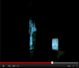
The shot then fades to black with the voiceover still continuing however, the TV is on but fuzzy shining light into the pitch black room. By the room turning very dark it could suggests some type of possessions of the girl which is a key theme to psychological horror. By the fuzzy TV being the only thing that’s left on it could be suggesting to the audience that the TV has a lot of relevance in the film and that there is something suspicious about it. While this is going on text start to appear on the screen which slowly comes up word at a time ‘fear comes full circle’ this is very effective as it correspondent to what it says on the movie poster. Also it gives of a bad vibe to the viewers and lets them know something bad is going to happen and builds up fear. Furthermore it the text synchronised with the voiceover which also give it more effect as it gives the viewers more of an insight on what the voice is talking about. The texts then begin to go fuzzy and once again slowly fades away this could suggest something’s going to change which engages the viewers to wanting to carry on watching. From 0.46 seconds there are visual effects also the voice, the fuzzy TV, the pitch black room and the texts all work together create suspense and makes it eye-catching for the viewers which also makes them question what is going on.
The shot then fades to black with the voiceover still continuing however, the TV is on but fuzzy shining light into the pitch black room. By the room turning very dark it could suggests some type of possessions of the girl which is a key theme to psychological horror. By the fuzzy TV being the only thing that’s left on it could be suggesting to the audience that the TV has a lot of relevance in the film and that there is something suspicious about it. While this is going on text start to appear on the screen which slowly comes up word at a time ‘fear comes full circle’ this is very effective as it correspondent to what it says on the movie poster. Also it gives of a bad vibe to the viewers and lets them know something bad is going to happen and builds up fear. Furthermore it the text synchronised with the voiceover which also give it more effect as it gives the viewers more of an insight on what the voice is talking about. The texts then begin to go fuzzy and once again slowly fades away this could suggest something’s going to change which engages the viewers to wanting to carry on watching. From 0.46 seconds there are visual effects also the voice, the fuzzy TV, the pitch black room and the texts all work together create suspense and makes it eye-catching for the viewers which also makes them question what is going on.
The camera then quickly cuts to a close up of the psychotic girl showing the viewers a glimpse of what she looks like. This is very effective as it create more suspense and tension for the viewers and leaves them questioning what that is or who is she? The voiceover has stopped and the non-digetic music has sped up and got louder which increase the viewer’s suspense. The trailer then begins to speed up and there is a montage and various quick cuts conveying different scenes with an upbeat non-digetic sound which makes it very effective as it syncs with the shots. In addition there is also a flashback editing around 1 minute into the trailer. It then cuts to cross cuttings and eliptical editing.
Moreover there are text effects which also fade in and out and then cuts to a black out. Last but not least it cuts to the website link as part of the ditribution of the film and then the company logo which is 'dreamworks'[ and finishes with by fading out.

