Textual Analysis
Film: Ghost Train
Release Date: September 30, 2006
Director: Takeshi Furusawa
Writers: Takeshi Furusawa, Erika Tanaka
Producastion/financing company: Cinematographer
Runtime: 92 min.
Language: Japanese
Country: Japan
Actors:
Erika Sawajiri, Chinatsu Wakatsuki, Shun Oguri, Aya Sugimoto, Itsuji Itao, Miyoko, Asada, Koki Kato, Shigeru Saiki, Yuriko Hirooka, Aja, Motofumi Takaya, Shiro Namiki, Shiro, Eiki Kitamura
Synopsis: On her way to school, high school girl Nana sees a train accident. But this is just the beginning of the nightmare that awaits her. Nana and her friend Kanae come across various bizarre phenomena, including red fingerprints and a female spirit who "lives" on the station platform. One day, Nana's younger sister is lost, and the only possibility seems to be that she had been taken by these spirits. The missing tracks. The predictions that a mysterious woman makes. Weird incidents which happen one after another. Entangled series of frights and mysteries lead to a shocking climax.
Trailer
Low lighting at the start of the trailer following through a tunnel connotes its mysterious, it's taking you to a dark place where you don’t know where it’s taking you, so this really helps game our minds, because people tend to panic because their taken to a unknown place.
There is normal lighting in the shot of the train, to make the trailer feel as if the films based of an everyday thing, so it helps feel the setting is ordinary, an everyday life. It also helps us feel as if nothing unexpected will happen.
The shot where the male is getting squashed under the train, the editing is slow motion, they did this to touch the audience, make them become weary to the pain, so they letting us witness’ a slow death, the edits close enough black and white this connotes its old fashion, so for this trailer I think this was used because they wanted to flash back to a scene which happened in the past, so the use of black and white connotes its old. So doing this represents times gone back.
Captions are used in single shots from time to time, this is like a narrative speaker but instead is written through text, this is like a story, and it’s describing where the mysteries take place. There are also narrative speakers in this trailer, which the narrative is the actor in this film, it’s talking from experience, its likes they are talking to story from their experience but is teaching us. Text are normally used in trailers to represent ‘time’ as a trailer has to be a certain amount of time, so by using captions it can really update the parts that we’ve missed. The font is white, with a glow around it, connotes it likes a ghost, and to really stand out more, they position the text behind the black background, so it pops out more.
There’s quite a few long cuts but suddenly a quick cut of a figure, which tends to make you jump, this editing helps you get curious, this helps the creators because the trailer is suppose to have the audience on the tip of their palms, and which fast pace it really grabs the audiences focus.
There are sounds of the train moving inside the tunnel, this is the main subject of the film’s title, this is to help the audience know that this films has something to do with trains and trains stations. When we hear trains going past, we would automatically think that we should stay away from the edge, so by a horror about train tracks you know for a fact that things will go wrong, because horrors are suppose to make you scared and jump, especially a thriller film because there are so many unexpected surprises.
Non-Digetic sound is used on the sounds of the unseen character, this is when you film a scene without any speech or sounds, but when it comes to editing it is added in. so in this trailer I think they used some sort of software which changes the voice of a human person into something that’s unrealistic, in this case making the person sound abnormal and not real, almost like sounds of aliens.
Pacing is quite slow at times, this connotes it wants to tell us a story so they want to show the audience by showing it slow so they can pick up all the meaning.

A quick shot was at this point, here there is NVC, it’s just a shot of the women’s facial expression, when this is shot it makes the audience clearly are that the actress is oriental, this can also be shown because Asians tend to have pale colour skin with black hair, so this really paints a picture in our heads that she is not British, this also sets a more freaky scene because normally Japanese films are twisted. It really captures fright in her face, looks like she is fearful. To compare this, it reminds me of the girl from the grudge, to compare the Japanese film to this; it looks like they got the look from the grudge, with the look of the pale face looking shocked with the black hair covering over her face. This idea is to keep a memorable face into our head that taunts our eyes, so we could remember it as an iconic way.
Movie Poster
These two posters connote horror, which have to fear and scare the audience; this film will be mainly being focused on horror lovers.
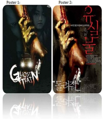
The main image of these two movie poster is the creepy hand grabbing the normal hand. In poster 1, it contrasts between the black and white photos behind it, so where as the main image of the injured hand pop out more, so its main focus is the colours.
The empty parts of the poster around the title ‘ghost train’ connotes it’s almost like a tunnel, because tunnels are dark.
When I compare the black and white images to the main image it almost looks not in focus so the depth of field is low, so it’s not as bold as the main image, I think they purposely done this to almost make the images fade into the black so they aren’t giving out too much detail, because they want the main focus to be in the centre of the poster.
The colour of the white for the title is white because its describing what the title is saying, because when you hear ghost you automatically think a ghost is white, and with the blend in of red at the bottoms make me feel as if blood has touched the ghost, making this seem different because ghosts are normally transparent so if you was to put stuff on it will go through, so its making us feel that even ghost can bleed.
When I look directly at the poster you automatically feel the poster is watching you, so from the direct eye contact of the models, it makes you feel they are watching you, making you feel tense.
The blood that is dripping from the womb almost looks as if the blood from the arm is dropping onto the title of the film, so it’s continuing from one image to another.
The colour of the hand, which is grabbing is yellowish, I think they chose this colour because they wanted the subject to look abnormal, something that is not human.
In comparison to poster 1 to poster 2, it is made into a Japanese version with Japanese writing. I think they done this to get a wider range of audience, so not only Japanese viewers could watch this but also other countries can be aware of the new film coming out. This helps increase the views for the film because they didn’t just think about the Japanese viewers but a wider range too, so the advertising methods is so much better.
Version 2 of the poster is bloodier and more thrilling as, more colour jumps out more. The colours are more harsh and intense. The patches of the grey and black in the background compliments each other to give that more spooky and uncomfortable feeling, because when you look at this think the posters filthy, so from the look of what the poster looks like you think the film will be as gruesome.
Comparing the detail of the hands from poster 1, this hand is more effective because it’s more realistic because the hand looks more normal, compared to the hand in the first poster, this is to play with the minds of the viewers because when they know something’s real and is disturbing, it’s more thrilling rather than a horror film about aliens because when they relate it to life, it could actually happen, whereas aliens are not real. The use of disturbing pictures helps evoke fear.
The text in poster 2 is written in Japanese, but by the way it is presented, it almost looks like the text is scratched up. It really compliments the theme of horror, because a horror poster is not suppose to look perfect and smooth, its needs that rough patch which this poster is showing us. They really want us to haunt ourselves to really be frightened, to really persuade us to go watch this movie.
In both posters they use a prop of some sort of letter with writing on it, this to me symbolizes that something inside that written letter is the cause for whatever is happening, which is also the root of the structure of the film.
In both posters one is clearer than the other about what the film consists of, as in poster one there is a clear image of the train and in poster 2 there isn’t, this really helps the viewers understand about what the film is about. So focusing on the understanding of the poster 1 did a better job at this.
Magazine Front Cover
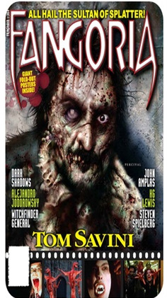
Masthead:
‘Fangoria’ is positioned on the top of the magazine roughly ¾ up and is mainly the largest text that you can see on the magazine. There is a black outline from the left of each lettering which looks to me as if its suppose to represent shadows, shadows are suppose to look like objects are lifting up so a shadow appears behind it, the same shape the object is, so for this shadow looking affect makes it look like the text is jumping out of the magazine.
The sharp points from the letters ‘F’and ‘A’ connotes fangs from a vampire or something, directly make sense from what the magazine is called, ‘FANGoria’.
The red stroke around the lettering appears the masthead to look bolder, making it look effective.
Main image:
There is a single image of an abnormal, disturbing woman with a scary looking face. It clearly matches the genre of horror, because the face looks frightening and off putting, because of the use of makeup they decided to put on the model. The face is big enough to stand out because her eyes are giving eye contact, making us feel uneasy because her face eyes are watching us.
Behind the main image is a texture of a dirty floor, which has splat brushes around to really give a fright to the magazine, they want to present their magazine as bloody and off putting as possible.
NVC: Through NVC we see that the women is dangerous by the way she looks, the use of her left eye blind and the other normal makes us feel unapproachable. Her gesture is a negative posture, as her hands look like she is strangling herself, this connotes that she is dangerous and mad. By looking at her face we see that it looks like she is warning us. And with the use of her gripping her teeth connotes anger, and frustration, also connoting that she don’t want us near her.
Puff:
A free poster is advertised onto this magazine. Posters are normally used in magazines when a film has some sort of fans. This helps encourage viewers to buy the magazine because automatically when you see something’s free you want it.
Under the writing of the free poster there is red splashes, this connotes blood splashes, this helps the conventions of horror because most horror are bloody and violent.
Cover-lines:
Capital cover lines are usually bold and can easily be read, placed on both sides of the main image, the subjects are parted by using different colours, this helps to separate the subjects so it’s clearer for the viewers.
At the bottom of the magazine there is a layout of a film strip, this helps aren’t a picture in the readers’ eyes that it’s a preview for scenes that’s taken from the movie, to give them a little preview about what the film could possibly be about.
Selling line:
“All… Splatter” this helps to grab the attention from the audience, so the selling line has to be catchy by memorable. They do this to convince the reader that this magazine is one of the best magazines on the market right now.
Barcode: The barcode is situated on the left third of the magazine. It is at the bottom of the front cover making it easy to notice but not distracting you away from the actual product which the magazine is trying to sell to you.
