For our magazine and poster, we have taken many photos to test out which photos we like best and that's suitable for our print, ranging from different positions, lighting and camera angles and also NVC. Some photos we didn't really like but some turned out great and have chosen which ones we would use for our final product.

|

|
This is where we took our photos and all the equipment we have used for this shoot
Photos for Magazine
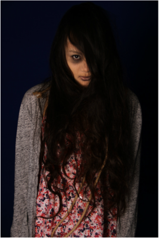
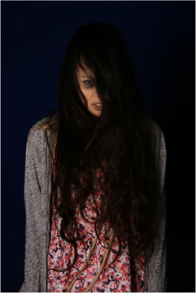
This photo is the one we chose, we find this most effective for our magazine even though it shows a lot of her face but we feel it looks best on the magazine cover and it's also in focus too.
|
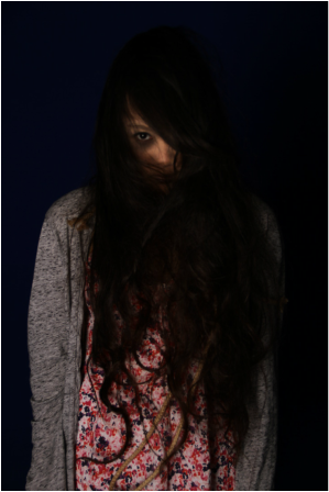
This one we like a lot but it's not as focused so we can't use it. We like the hair in front of her hair but unfortunately it cannot be used.
|
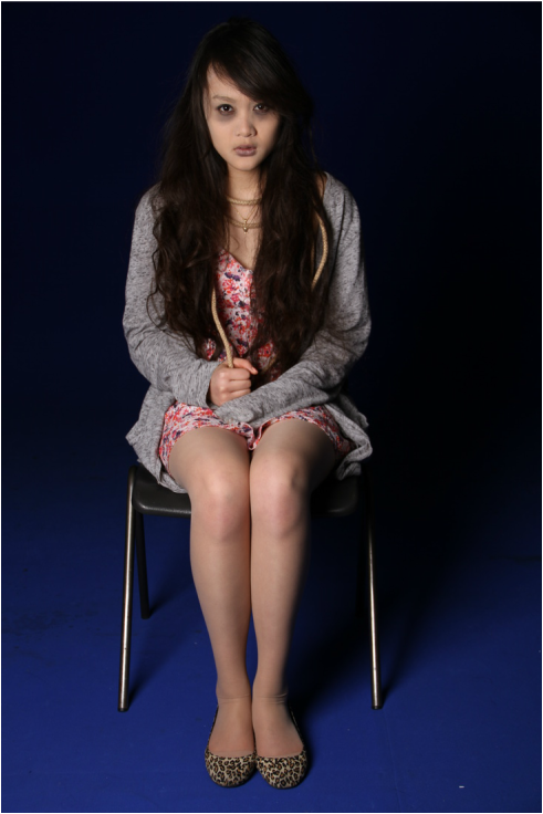
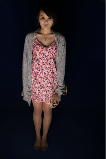
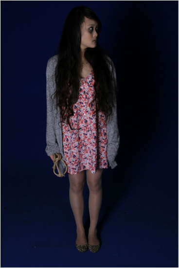
This shot we also like but it's a bit simple and not effective as much and doesn't go with what we wanted to do on our magazine.
|
Here with the character showing half of her face looking directly at the camera we did like this one also but wasn't really sure whether to use it or not.
|
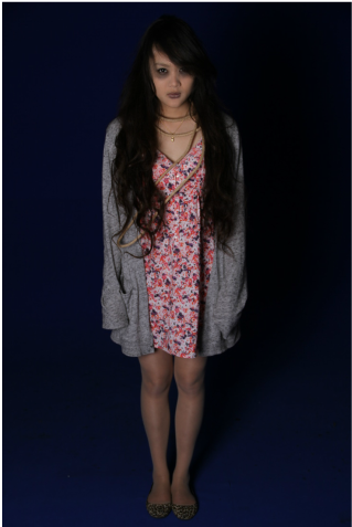
In this photo we can see her make- up clearly and we like this but it wasn't the way we wanted it to.
|
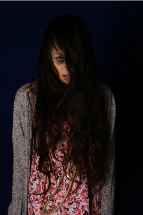
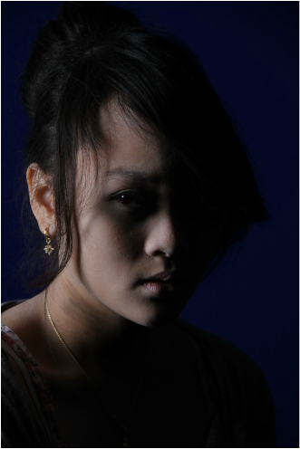
Her facial expression is quite strong in this photo and helps capturing the viewers eyes.
|
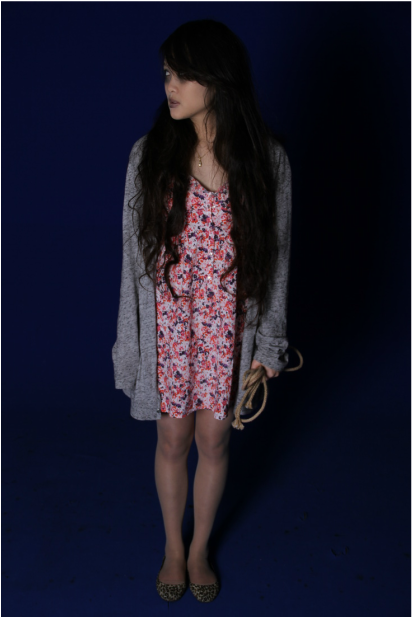
Both of these photos, we took it with the characters looking to the side connoting they are looking at each other even though it's just one person for both
|
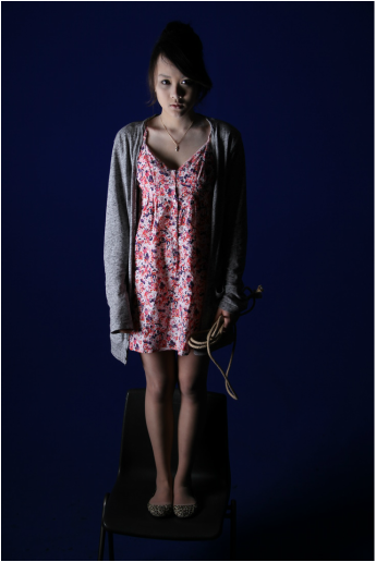
In this photo, the soft box lighting came from the ground below her, we did like this one because it looks very powerful and it looks like she's glowing. It is alos the photo that we've chosen for our poster because of the reason above
|

We didn't really like the lighting in this photo as the soft box was on the side, it doesn't look very sharp to us.
|
The close up shot of her was our orginal pln for our poster but it didn't work out the way we wanted it to and doesn't look very good.
|
This one shows too much of her face and make- up which we didn't really want to be in the poster.
|
