Mock ups/Drafts for Film Magazine and Poster
Mock Ups for Film Poster (Vi Le)
|
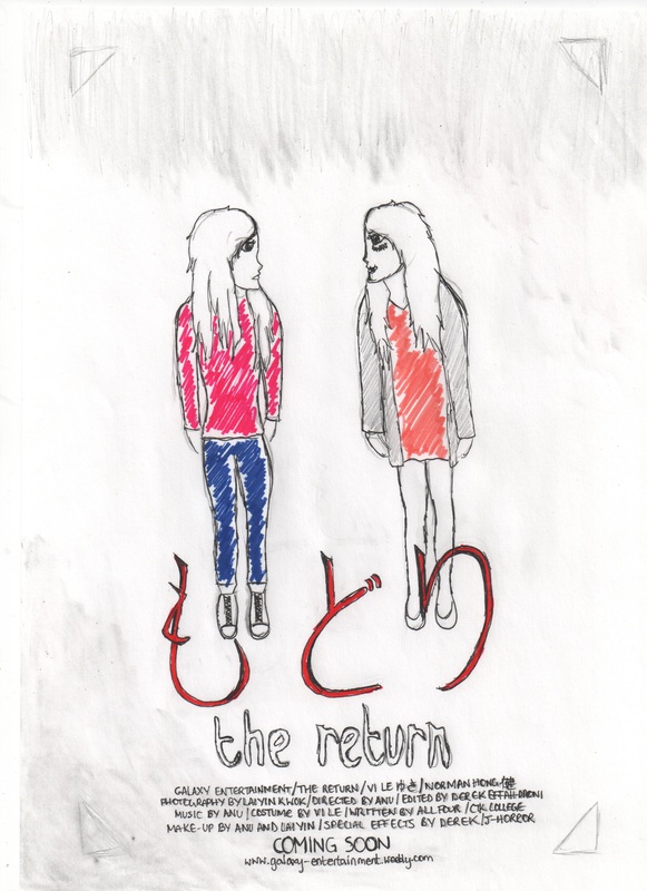
This is our first idea for our poster, we liked this one a lot but when taking the photos it didn't turn out the way we wanted it to. The main color scheme for this poster that we think would be suitable is black, white and red. The background would mainly be black and looking dirty. We put the tagline half way at the top and bottom of the photo because, it's like a cliff hanger, where the title is placed we believe it's most eye catching along with the photo. |

IDEA 1.
|
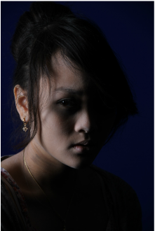
This is the photo we tried out for this idea to see it it will work or not. What the poster meant to be is a reflection of of the girls face, one bad side and one good side connoting the two characters in the trailer who are different people but look the same. |
|
This is our second idea for our poster, this one is not effective as the others and we didn't like it as much. The main color scheme for this poster would also be black, red with white for the credits at the bottom to follow the conventions of poster. This time, the tagline is at the top of the credit and the title is placed at the top, this looks better and more sufficient. This is the chosen idea that we will use but will change some things around to make it look more like a horror poster by editing through Photoshop. |

IDEA 2.
|
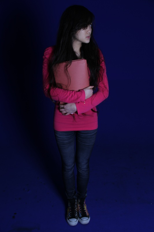
We tried to take photos for this photo idea also, it did turn out the way we wanted it to. This poster is of the two characters that was in the trailer. One girl is in color and one is in black and white because that connotes that she's the evil one. |
|
Our third idea, we was fond with but we thought it didn't look like a horror trailer a lot so we wouldn't want to use this idea. The main color scheme for this is white, black , blue and red blend in together with white fonts. The Title is at the bottom again for this poster because it looks better than having it at the top and thats where the tagline is placed, plus most film posters have their title there. |

IDEA 3.
|
In this poster idea, we put the main guy from the trailer in the poster and placed in the middle and the two girl characters on the side. |
|
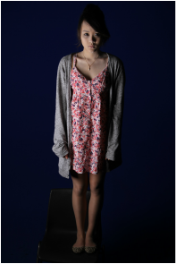
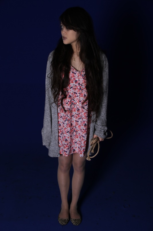
Our fourth idea, we like the how we can place two characters together to make it as if they are looking at eachother. The photos turned out quite well. The main colour scheme for this poster is black, the background would be dark and gloomy. The characters would be holding props such as books and an a rope because those were shown in the trailer. This poster we have the title of the film in Japanese larger than the English title because we thought it would stand out more with the credits at the bottom. |
Idea 4
|
Here are photos we took for this idea, we ttok several to see which one is the best to use. This last idea, we have the two characters looking at each other, one with make- up connoting the evil one and the normal girl |
Mock Ups for Magazine Cover (Lai Yin)
Magazine Layout Ideas:
IDEA 1 + 2
|
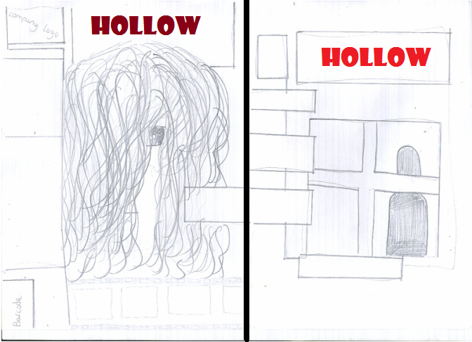
Idea 1: This idea I want a close up of the girl covering her face and one of her eyes showing.. Below is a test shot I tried doing with the camera.
On the left side I wanted the main cover lines and on the top left a section where our company logo is. Test Shot for Idea 1
I purposely decided to take this photo a little out of focus, because I didn't want to give the story away, so by the black hair overlapping her pale face really brings out the area where her eyes are.
|
Idea 2: This idea I just wanted a figure of the girl behind a window, to connote a stalker, which relates to what our trailer is about.
|
IDEA 3+ 4
|
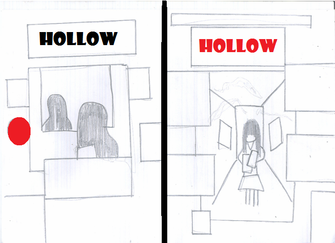
Idea 3: This idea will show the main girl looking into the mirror, with the reflection of the possessed girl.
|
Idea 4: This idea I really wanted to show the main location of our trailer, so in this idea i want a image of the girl carrying her books in the school corridor.
|
IDEA 5 + 6
|
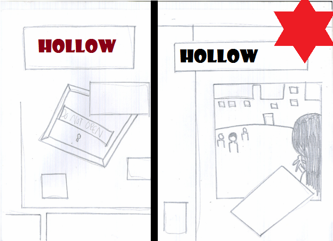
Idea 5: Idea 5 I wanted a image of a locked box to connote 'possession' which could mean hiding the truth, as our trailer will be about a possessed girl.
|
Idea 6: Idea 6 I wanted a image of a over shoulder shot of the main girl looking at the main boy outside of the college building.
Ritz Film Magazine
In comparison with this magazine to my drawing, it's an over the shoulder shot of the main person looking at people in the background with are out of focus.
|
IDEA 7 + 8
|
Idea 7: Idea 7 I wanted a image of the girl looking down to the grounds of the college, this will be a birds eye view. I wanted this to connote death and decisions.
|
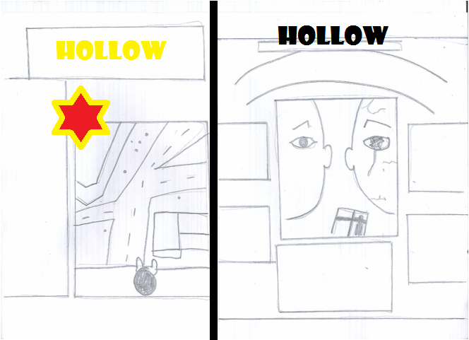
Idea 8: Idea 8 I wanted a symmetrical image of two faces to represent the normal girl then the possessed girl.
|
Chosen Magazine Layout:
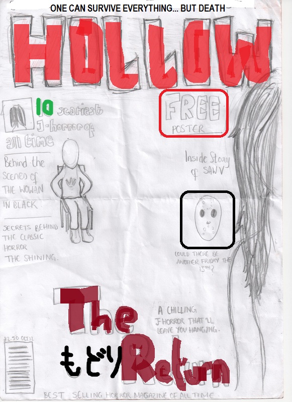
As one can see I added in the main conventions of a magazine..
Masthead: I want ‘Hollow’ to be positioned on the top of the magazine roughly ¾ up and is mainly the largest text, so the name of our magazine will really jump out. I want the masthead to be quite dark and gruesome to really represent a 'Horror' magazine.
Main image: The main image will be the main girl, a mid shot from above her feet to top of head, and behind her there will be an image of the male blurred slightly in the background, to represent his distant. On the magazine I want the models eyes to connect with the readers so they will be drawn to our magazine, with the use of image we will use.
Cover lines: In our magazine it will also cover lines going down on the left hand side and some in the middle, letting the readers know what the pages contain.
Selling line: But in bigger text than the rest with a more bold colour, there will be a main cover line at the bottom saying 'The Return' which is the name of our trailer, with this convention it will draw in the reader because it will show that it's the main topic to read about in the magazine as it will jump out more compared to the smaller cover lines on the side.
