|
Forms and conventions are what helps identifies a trailer as a trailer. Also
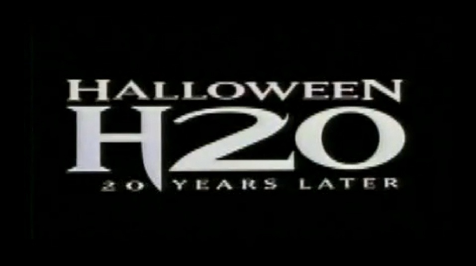
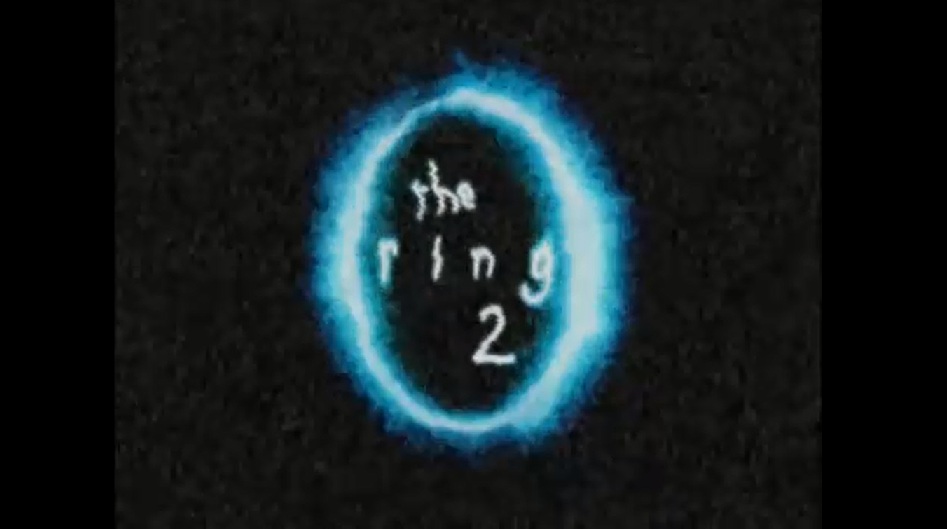
it help differentiate trailers from other aspects of media such as soap operas and documentaries etc. The use of conventions are to allow the audience to distinguish what type of media product it is and enable them to decide in which what type they want to watch. There are various conventions of teaser trailers ranging from timing to pace of shots. In addition to teaser trailers are also movie magazine front pages and movie posters in which also have their only conventions which you have to follow through for it to be all combine. To help us gasp the form and convention of horror trailers we looked at existing media products to give us guidance on what steps we should follow. We carried out textual analysis on existing horror trailers, this was a key essential in helping us understand what forms and conventions a horror trailer especially J-Horror consists of. We gathered research either from watching horror trailers such as; I spit on your grave, Halloween h20 and also viewed horror trailers of the same them we were doing which was J-horror which were; the ring 2 and one missed call. From all of this we could see what type of lighting, sound, and editing was used to make it effective as a horror trailer and then noted down some ideas aswells as cooperating with our own in which i our group has discussed to produce a successful product. |

|
|
Teaser trailers are made to entice the audience and inform them on the new film being released. Teaser trailers are seen as very important in the success and marketing of the film as trailers are what the audience first see and that’s what they tend to help make the decision if the film is worth watching. This then turns into an underground buzz which is when the public talk about the film and tell their friends and family about it and so on. In addition it is also vital that the teaser trailer and poster and magazine combine well together and are of the same quality, as this helps the audience identify the film much easier weather its from the magazine, poster or trailer. Scream is a good example of this as they had consistency throughout their campaign such as; poster, trailer, toys and even costumes etc. Scream was recognized globally as they continuously followed conventions in all their products such as including the iconic weapon which was a sharp blade, and the villain masks. |

|


Moreover another key convention in horror trailers are the sound. Score and incidental sound are a key factor in creating a successful trailer. The sound is very effective as its what glues the shots together also it helps create suspense and tension for the audience. In order for us to create the right sound we had to research various trailers and see what their sound was like and noted weather we not we thought it was good. By doing this we could see what type of instruments were used, the tone, the pace and also the duration. Watching many horror trailers it became evident that Halloween h20 had the most effective sound. The reason being it was the one which caused the most suspense as it went from quiet to loud. By doing this it shocks the audience at the end and as the sound is repeated the audience can become familiar with it and so if they hear it anywhere else it would be easy to recognize. Therefore we then decided to adapt this convention to our own trailer. However we slightly changed it by instead of it being a repeated sound, the tone and beat and instrument changed half way through after using more quiet and tense music in the beginning. From research we noted that this was common with J-Horror trailers therefore we felt that it would be more suitable for our trailer to do it in that particular style.
Halloween h20 trailer (sound)
Although we could not develop that convention to its full potential we tried to keep ours consistent in its trailer, magazine and poster.
We kept the same font, style of caption, layout and also the use of red, black and white in all 3 products.This is very effective as it enables the products to cooperate well together. One key advantage of this is so that the audience can see how we the 3 products relate to one another and makes it easier for them to identify the film whether or not their in another country.
We kept the same font, style of caption, layout and also the use of red, black and white in all 3 products.This is very effective as it enables the products to cooperate well together. One key advantage of this is so that the audience can see how we the 3 products relate to one another and makes it easier for them to identify the film whether or not their in another country.

|
|

|
|

|
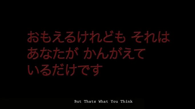
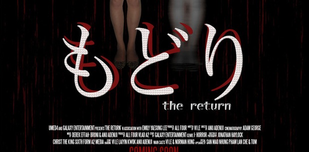
(Picture of Japanese
and English captions)
Furthermore as we decided to chose J-horror as our theme we thought it would be great help to take a deeper look into existing j-horror trailers so that we can see what they consists of to help us generate ideas on how what we could include in our own trailer and also be similar and consistent in the theme. We chose to focus on the
forms and conventions conveyed in the ring 2. The ring 2 is also a psychological as well as j-horror film and is part of a sequel. The main plot of the film is about a video tape which when watched the Japanese girl who is the villain comes down from the TV and grabs and kills you. We have adapted some of the conventions in this trailer
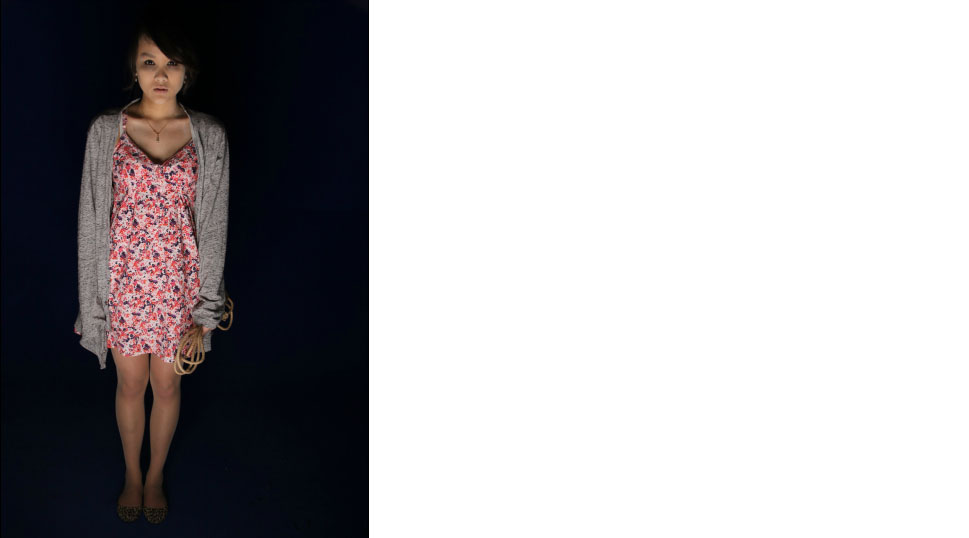
into ours such as the main villain as we also decided to use a Japanese girl who looked similar to the girl in ring 2 which has long hair, fairly small and quite pale.
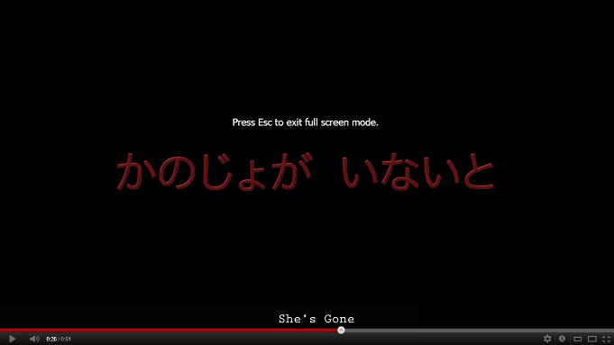
However we decided to challenge the conventions by adding Japanese captions with English subtitles. This is different from many j-horror trailers as they tend to have English captions which portrayed in one missed call and the ring 2. The reason for doing this was because we wanted our product to be quite unique from the other existing products so that it would be able to stand out. This is a beneficial factor for the media market as audience are always looking for new things. Moreover this idea of the Japanese and English helps widen our target audience as people who speak either language can understand and follow along with the film.
|
Another convention in which horror trailers tend to adapt is the use of dialogue. Most horror trailers that we have watched tend to have some dialogue including range from vast amounts to couple words. This is effective as it engages the audience and makes it easier for the audience to follow on with the storyline. However we decided to challenge this convention as we did not include any dialogue. We made this decision as we believed that there are also various advantages to no dialogue such as; creates more suspense for the audience which is vital in grabbing your audience attention. Also it ensures that the audience focus on the trailer so that they can catch on the story line and last of all gives more effect to the shots and sound which can have an positive impact on the audience. Also we felt without dialogue it made the trailer a bit simpler and less busy than how it would be with dialogue. |
|
Poster

|
Our poster supports various conventions portrayed in existing horror posters.In order to ensure we kept and followed certain conventions we researched on existing horror posters. This was very helpful as it enabled us to see what ideas we would like to adapt into ours and which parts we could change to give our poster more of a unique look which is very important in the marketing field as its main purpose is to be eye catching and grab the audience attention. |
From the existing horror posters we researched we noted that they all had main image in the center which was fairly big. This is very effective as this is the first thing in which the audience see. However to make this a success we decided to take a long shot of the main character so that the audience can get the full image and a shot of the setting as well as it just being a close up of a character as that just has one focus which is what the grudge did.
|

|
|
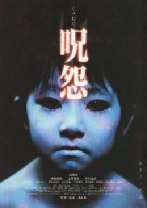
We decided to use the grudge as a guideline in how our poster should be constructed. The reason we chose this poster as it was most similar to the poster we wanted to create as they are both of the J-horror genre. The grudge poster is close up shot of the character which is very effective as it shows the nvc on the character. In this poster there is low key lighting, this is one key convnetion in which we wanted to follow as in many horror poster they tend to be a dark lighting as it dwells on the horror theme alot more.
|
Moreover we developed the convention portrayed in the grudge poster with the use of Japanese captions as we felt it was more effective and suitable to the J-Horror genre. This is also quite unique as
many horror posters who are also of the J-Horror genre still have captions in English therefore, to capture both cultures; english and japanese and also to make ours stand out, we blended the both languages in our subtitles. As a result of this we can also expand our target audience.
|
|
|
|
In addition, unlike the grudge movie poster we challenged some conventions in order to make our poster look more unique. We did this by repositioning our movie title at the bottom of the image instead of at the top where it is usually placed in which we noticed when carrying out our research on exisisiting horror posters. Also we decided to put the tagline across the top page. We believed by having this layout it made the poster look nice and simple and created a bit more suspense.
|
Magazine
Our magazine develops various forms and convention in which our conveyed in many existing horror magazines. In order for us to keep the consistency we researched different magazines to identify in which conventions they had in common. The first convention we adapted was the position of the main image. We decided to follow the other magazines and also place our main image which is the main character which is often the case in magazines in the centre. This is effect as it is very eye catching and is the first thing which grabs the readers attention.
We also developed the layout in which horror magazines tend to have with the masthead being at the top of the image with some text slightly behind the main image. This is important for it to be bold and big so it can stand out on the page and let readers identify what magazine it is.
We also developed the layout in which horror magazines tend to have with the masthead being at the top of the image with some text slightly behind the main image. This is important for it to be bold and big so it can stand out on the page and let readers identify what magazine it is.
|
|
We also developed the convention of the cover lines being listed down the side. However to prevent the page looking to busy and to keep the font and colour theme consistent, we kept the cover lines red rather than a different colour, which is the case in various magazines. Another way in which we followed the conventions were ; by including a bar code, date and price. This is very common and useful in many magazines, bar code is used for people to identify which magazine it is and also enables the magazine to be purchased. |
|
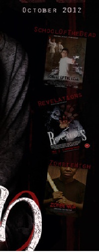
Although the majority of our final product of the magazines follows the conventions, we decided to challenge parts such as adding to it, this allowed our magazine to be more unique and added style to it. We included different posters and magazines of other horror films as a part of advertising along the side going down. These also act as coverlines. 
|
|
