Film Poster

Intro: I will be analysing the different attributes of a horror film poster front cover including looking at how mise-en-scene is used and also how the magazine is designed to attract its readers and target market.
The final destination film poster is design to simply portray the movie as a horror movie. First of all what I noticed on the poster is the tag line which denotes ‘death saved the best for 3D’’ which in media terminology is a pun and it include the word death which is done on purpose to attract the preferred type of audience straight away to the movie. The tag line also include the word 3d which also the producers intension to attract or draw close the eyes of the films target audience which I presume would be certificated 18 because of the content within the movie.
The final destination movie is in 3D but in other posters it says 2D which simply means the film is in a 2D as well as 3D. This was shown in certain theatres. This final destination film poster dates the date in which the film would be released simply to let the audience to prepare themselves for a thrilled experience .The colour in which is written in and the font chosen for it is in red and the background colour of the poster is smoky navy blue, this is perhaps insinuating that the movie is threatening. To compare some film posters write the actors and actress names on the poster but on this poster it doesn’t which is done on purpose because final destination always feature new actors and actress in every new edition.
On the final destination film poster the first thing that attracts the audiences eyes is the half skull and a shattered glass situated right in the middle of the poster which takes up 2 thirds of the page. This is a single image which is the centre of attraction so it’s shown to be a main image. The image denotes a half skull and half skin of the head shows that the person is dying as skin represents life and skulls represent death and the glass shattering enforces the destruction/death theme of ‘death’ killing people. As it signifies that within the movie people die.
In my opinion the final destination poster is effective because it shows the theme of death as well as showing it is a poster for a horror film by featuring the death convention and mostly dark, cold colours. I think the dark, cold colour scheme is a common convention of horror and an effective one, the only other scheme I am aware of is the dark, red colour scheme. The importance of an effective colour scheme is that if a film poster had mainly yellow and pink, it would not connote a horror film. The selling line on this film poster is very short, sharp and meaningful as it quotes ‘death saved the best for 3D’.
First of all there is a NVC being portrayed by this shattered half skull in the main image as its facial expression and body language is negative as it could connote death. The lighting is very low key showing the whole essence of evil and death.
Conclusion: In conclusion this textual analysis of this horror film poster is very useful as it could help me consider things I could include in my own horror film poster.
Magazine Cover
Intro: I will be analysing the different attributes of a horror magazine front cover including looking at how mise-en-scene is used and also how the magazine is designed to attract its readers and target market.
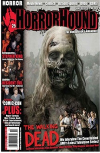
Mast Head: This magazine front cover has a master head which is straight away recognised on top of the page behind the main image. The font is very bold and symbolic as it is written in a san serif font. The colour used is red and perhaps it could connote evil and blood.
Date line: This magazine was published in the summer as it says sep/oct 2010. The date has a significance which shows it could be published through out that period. It is located on the top right of the front cover.
Main Image: In this case there is a single big image at the front of the cover. There is straight away eye contact from the audience. This shows that this image is a centre of attraction and therefore can be called the main image. This image denotes a young scary skeleton woman looking like a zombie (half dead); this links with the master head.
Cover lines: horror hound magazine uses a reasonable amount of cover lines. This cover lines are specifically dispersed at the bottom the magazine and also the main image. In my opinion the used of field of depth is being used in such a way that even though there is a huge doze of cover lines it doesn’t detract viewers from the main image. Also there no cover lines are over lapping onto the main image. In this case there are only three font colours used which I presume does not clash with the image.
Left third: The left third of this horror film magazine is vital and important for sales in shops where the magazine is not shown full-frontage. Mainly the left-third consist of brief info on thing that are included in the magazine as on this horror film magazine it shows left-thirds which shows ‘resident evil’ , ‘Stephen king’ etc… I believe this are issues raised or other people of the public sharing their ideas. The left-third doesn’t affect the title of this horror film magazine as it’s clearly seen as the main image.
Barcode: There is a standard barcode on the bottom left-hand corner. This is basically an optical code and used to read data and information based on the widths of the black lines. It could also be used to describe the item or if it’s stolen it could make noise at the detectors at the end of a shop to show it has not been checked out.
Selling line: The selling line on this horror film magazine is very small and significant as it quotes ‘the walking dead.’ I believe this is the title’s main marketing point.
Mise-en-scene: There is mise en scene in this horror film magazine. First of all there is a NVC being portrayed by this zombie in the main image as his facial expression and body language is quite scary and evil as it could connote that its about to kill. The lighting is very low key creating an atmosphere of evilness and mystery. There is a blur as if the audience look closely at the background as there are other zombies or perhaps half dead people.
Conclusion: In conclusion this textual analysis of this horror film magazine is very useful as it could help me consider things I could include in my own horror film magazine.
Movie Trailer
Horror teaser trailer
The teaser horror trailer I would be talking about is the one of the collections of saw and its saw vi.
Sound
First of all the teaser trailer has a non diegetic sound played through out the trailer. This sound is sort of action soundtrack which gets the audience excited as there is something about to happen but as the trailer goes along it builds up tension and suspense which brings about fear and trembling to the audience. Also there are diegetic sound of people screaming revealing quite of a horrific atmosphere and environment. sound effects are also used in this trailer reason being for it to leave and impact on the audience.
Narrative
The narrative behind this teaser trailer is that is that it shows different event of how people die. And also the torcher and also the way people are killed. All saw collection portray the essence of death as its a horror genre.
Audience
The audience are taken on a trip through and abandoned building with flashing lights. There are various parts in the building where the audience witnesses horrific images and horrific events.
Colour/ lighting
The colour and lighting of this teaser trailer is very dark and humid as there is only flashing light which seemed like the bulb is dying out. This is done on purpose to show a very evil feeling and also a horrific atmosphere. It is also a symbol to show what it would be like in the actual movie.
Costume/ make up
The costume and also make up used in this trailer its seen on television screens and as an audience the make up used is very realistic as its done to a professional quality. The costumes are rough torn and full of blood. It makes it depressing and frightening as the make up goes well the costume seen on the characters.
Editing
Editing technique used in this teaser trailer is very quick sharp and smooth. There are no transition and cuts surprisingly. The camera technique used is a point of view shot as we are taking through the trailer as if we were in the trailer. This is done in such a way that it involves the audience.
Conclusion
In conclusion of this analysis the teaser trailer ends with a dateline which denotes Halloween 2009. This is quite an interesting dateline as the film would be released in Halloween as the film is a horror film it would attract more audience in this period and there would be revenue at box office
